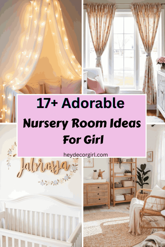
Nursery Room Paint Ideas Designing your baby’s space is a special journey, and one of the most powerful ways to set the tone is through color. Hi, I’m Richa, and I’ve gathered some of the most calming, creative, and cozy Nursery Room Paint Ideas to help you build a space filled with comfort and charm. Whether you prefer soft pastels, warm neutrals, or bold, modern shades, paint plays a huge role in shaping the mood and style of your nursery. From statement walls to subtle washes, each choice adds personality and heart. These paint ideas are perfect for creating a soothing sanctuary for your little one.
Nursery Room Paint Ideas

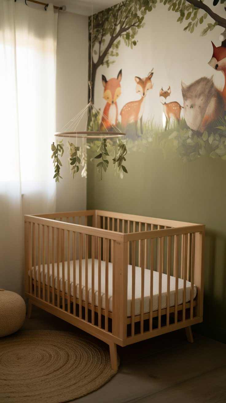
Soft Sage Green Walls
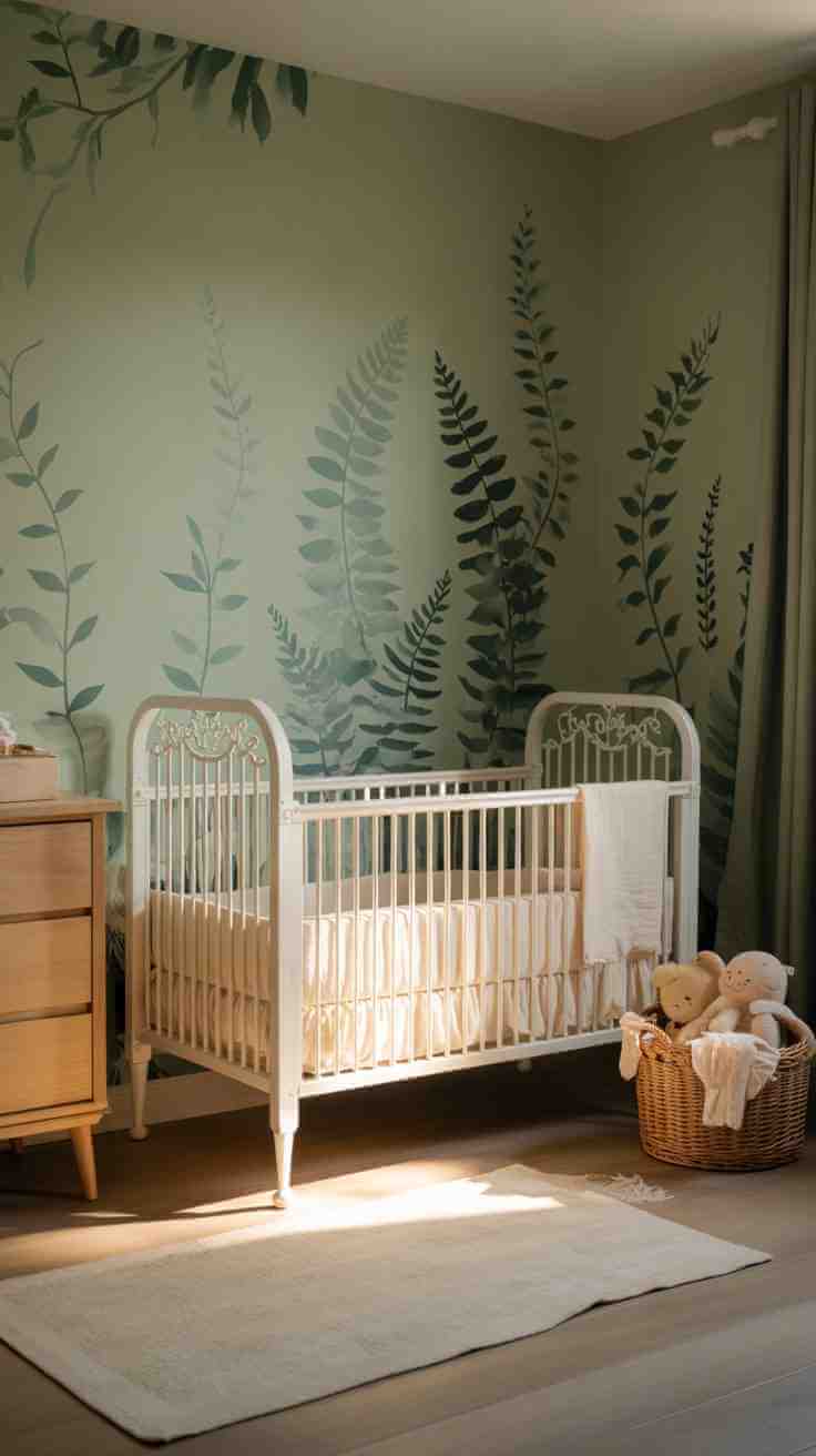
Soft sage green brings nature indoors while keeping the mood calm and refreshing. It’s a perfect gender-neutral choice that pairs beautifully with wood accents, neutral textiles, and natural textures. This hue works in both bright and dim rooms, and it never feels overwhelming. You can use it as a full wall color or pair it with white trim and a leafy mural. It’s soothing enough for nap time and playful enough for floor time. Sage green also grows beautifully with your child, transitioning well into toddler years without needing a full room redo. It’s timeless and grounded.
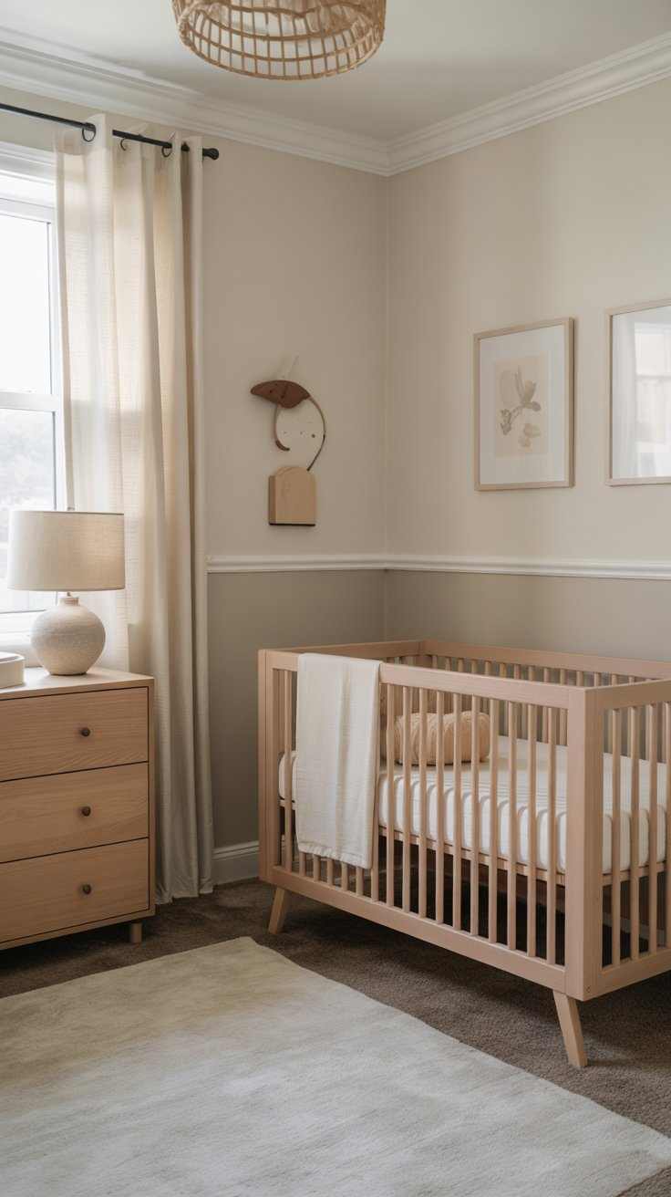
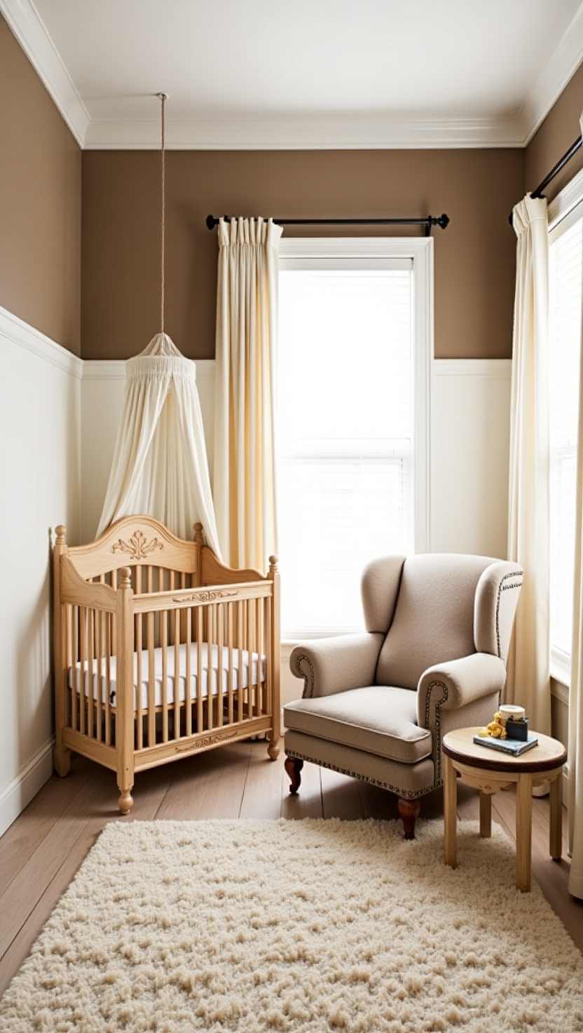
Warm Taupe Neutrals
If you want a cozy yet sophisticated base, warm taupe is a beautiful option. It provides a soft foundation that works with both pastel and earthy color schemes. This color enhances natural wood cribs, woven wall hangings, and soft lighting. It’s an ideal paint for parents who love a minimal look with plenty of warmth. Taupe doesn’t feel sterile like some greys, and it allows your decor to stand out without clashing. Add cream and white layers for a breezy feel or darker rust and olive tones for richness. Taupe makes your nursery feel comforting and complete.
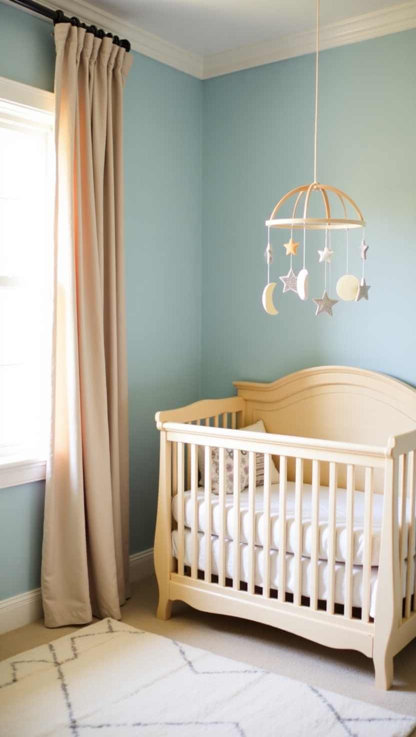
Sky Blue and White
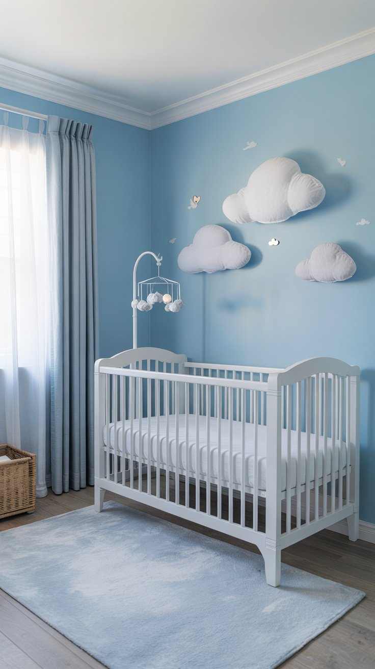
Sky blue with crisp white trim creates a peaceful, airy vibe perfect for dreamy naps and early mornings. This color scheme is especially ideal for smaller nurseries because it opens up the space. You can add cloud decals or go with a soft gradient to mimic the open sky. Sky blue works wonderfully in rooms with plenty of natural light, helping everything feel fresh. Pair it with white furniture and soft grey or silver accents for a clean finish. It’s a classic choice that still feels current, making your baby’s room feel open and imaginative.
Lavender Grey Blend
Lavender grey is a chic and soft alternative to traditional pinks or purples. It brings a modern touch while keeping things gentle and serene. This blend works well with white, soft gold, or brushed brass accents. It gives the nursery a dreamy quality without feeling overly sweet. Lavender grey looks especially stunning in nurseries with floral or star-themed details. It’s perfect for accent walls or full coverage, depending on your style. Add in textured rugs and cozy blankets, and the whole room feels like a warm hug. This shade is perfect for quiet bonding and stylish comfort.
Muted Terracotta Accent
For a warm and grounded touch, a muted terracotta wall adds beautiful depth to your nursery. Use it as an accent behind the crib or along the lower half of the room with a soft beige above. This color adds warmth without overpowering the space, making it feel cozy and welcoming. It works wonderfully in boho, rustic, or nature-inspired themes. Pair it with cream, clay, or wood tones for a perfectly layered look. Terracotta is ideal if you want a pop of color that still feels calm and earthy. It’s bold yet soft—just like baby’s first space should be.
Misty Blue and Beige Combo
Combining misty blue with beige creates a relaxing and balanced nursery environment. These shades complement each other beautifully and work in both large and small rooms. Misty blue is soft enough not to feel cold, and beige adds warmth without too much contrast. Together, they form a peaceful backdrop for everything from modern cribs to traditional rockers. Use them in wide stripes, color-blocked walls, or each on opposite walls for interest. This combination grows easily with your child and offers flexibility for different decor styles over time. It’s gentle, cozy, and fresh.
Pale Blush Pink
Pale blush pink is timeless and elegant, especially in a nursery setting. It feels soft, sweet, and never overwhelming when used thoughtfully. You can paint all four walls in this hue or pair it with soft white wainscoting for balance. Blush pink works well with warm wood tones, gold accents, and delicate floral prints. It’s an ideal color for creating a warm and welcoming environment that still feels feminine without being overly traditional. The shade also photographs beautifully, making it perfect for capturing baby’s milestones in a soothing space filled with charm and comfort.
Dusty Rose Walls
Dusty rose adds a vintage and romantic feel to the nursery while still being soft enough for everyday comfort. It’s a more mature pink that transitions easily as your baby grows. This hue works perfectly with cream, light grey, or gold tones and looks beautiful alongside boho or classic nursery themes. Dusty rose is especially charming when paired with floral rugs or vintage-inspired furniture. It’s a color that doesn’t go out of style and always feels personal. Whether you go bold with all walls or use it as an accent, dusty rose brings grace and character.
Two-Tone Neutral Walls
If you love clean design with a twist, two-tone walls in soft neutrals create visual interest without overpowering the room. Try a lighter shade on top, like ivory or cream, and a deeper one below, such as greige or sand. Use painter’s tape to get a crisp edge or add a decorative chair rail for definition. This approach adds style while keeping the nursery feeling light and serene. It also gives you a nice backdrop for furniture and art. Two-tone walls are especially great for small rooms where full contrast might feel too heavy.
Buttercream Yellow Glow
Buttercream yellow brings a soft glow to your nursery, creating a space that feels like sunshine year-round. It’s warmer than white but still light enough to open up the room. This color is ideal for a cheerful, gender-neutral space that feels cozy from morning to night. Use it alone or with white trim and pastel accents to make the room feel brighter. Buttercream yellow pairs well with natural wood furniture and woven rugs. It’s a color that lifts the mood and offers a gentle warmth to the nursery—perfect for newborn cuddles and playful moments alike.
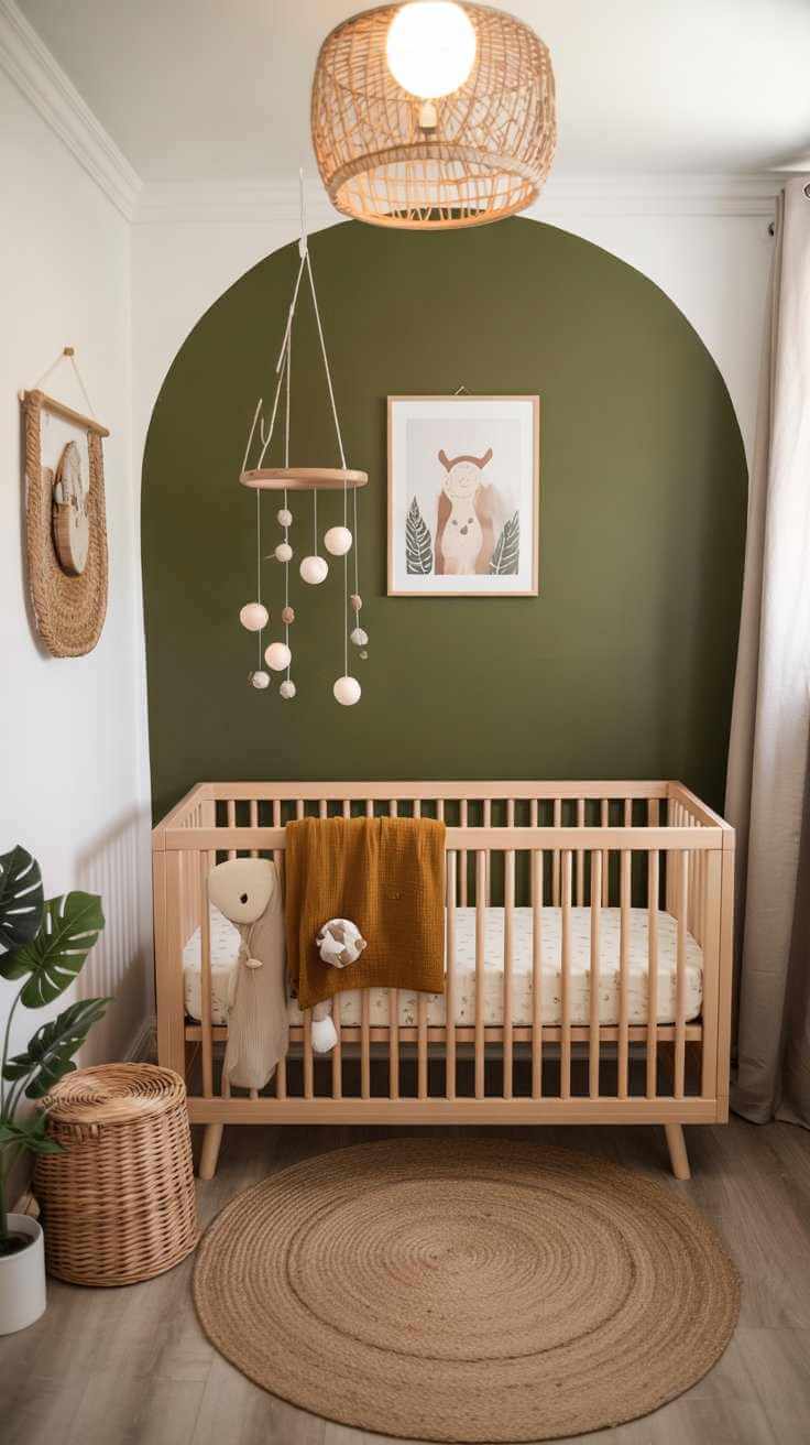
Olive Green Accent Wall
Olive green adds depth and a natural feel to your nursery while staying calm and sophisticated. Use it as an accent wall or in a color-blocked design with cream or white. Olive green works beautifully in both modern and rustic themes, especially when paired with wood textures or neutral textiles. This color creates a cozy atmosphere that’s rich without being too dark. It also complements animal-themed or forest-inspired nurseries well. Whether you want to build a woodland scene or just enjoy a grounded tone, olive green brings stability and warmth to the room.
Powder Blue and Grey Combo
View this post on Instagram
Powder blue mixed with soft grey gives the nursery a dreamy, floating feel. These tones work well together and add lightness without feeling washed out. Powder blue is perfect for calming energy, and grey adds a modern softness. You can alternate the colors on different walls or use blue on the top half and grey below. This pairing creates a perfect base for both minimal and whimsical decor. Add fluffy rugs, soft toys, and pastel artwork, and the whole space comes together with harmony. It’s peaceful, versatile, and timeless.
Peachy Cream Walls
Peachy cream tones bring softness and light to the nursery with just a touch of warmth. This color is wonderful for baby girls or gender-neutral rooms where you want a little sweetness. It pairs well with white, soft coral, or even mint accents. Peachy cream makes the nursery feel fresh, playful, and open without being too bright. It’s also a great shade for layering with boho or vintage touches. Whether used on every wall or just one, it creates a warm, cuddly vibe that welcomes your little one home in the sweetest way.
Gray-Green Serenity
A muted gray-green gives the nursery a peaceful, natural feel. This tone sits between cool and warm, making it incredibly versatile. It pairs well with wood, cream, brass, or white elements, and it works for both boys and girls. Gray-green helps soften the space and creates a calm environment that’s ideal for sleep and quiet play. It’s especially pretty with forest, animal, or plant-themed decor. If you want a color that feels rooted in nature without being too bold, this is it. It blends modern elegance with gentle comfort perfectly.
Dusty Blue Elegance
Dusty blue offers a mature twist on classic baby blue. It’s calm, slightly moody, and gives the nursery a refined yet dreamy atmosphere. This shade works beautifully with white trim, natural wood, or warm beige accents. It can be used throughout the room or as a subtle feature wall. Dusty blue pairs especially well with nautical, starry night, or vintage themes. It’s peaceful enough for quiet naps but still stylish enough to impress. This tone feels timeless and soothing, perfect for parents who want a gentle pop of color without anything too bright or overwhelming in their baby’s space.
Creamy White with Subtle Tint
If you’re drawn to simplicity, a creamy white paint with a slight undertone—like blush, taupe, or grey—can elevate your nursery without looking flat. These barely-there colors add warmth and depth to the walls while keeping the space feeling open. Creamy whites are incredibly versatile and match every decor style from modern to vintage to boho. Add interest through textures like woven baskets, rattan accents, or colorful artwork. This option is perfect if you want to keep things minimal and let the furniture and accessories shine. The result is a bright, serene space that’s easy on the eyes.
Muted Mustard Accent
Muted mustard gives a nursery an earthy, boho feel without being too bold. Use it sparingly—on one wall, doorframe, or dresser—to add a golden warmth. It pairs perfectly with neutrals, forest green, and dusty rose. This color feels rich and playful, offering visual interest while still feeling grounded. Mustard tones work great in animal, safari, or vintage-themed rooms. They’re also gender-neutral and photograph beautifully. Even a small touch of this color can warm up the entire nursery and give it a more styled, intentional look. It’s ideal for parents who love cozy, vintage tones with a twist.
Soft Mocha and Cream Split
For a cozy and welcoming vibe, combine soft mocha on the lower wall with cream on top. This duo brings both warmth and brightness to the nursery. The split can be done with a horizontal paint line, paneling, or even a wallpaper halfway up the wall. Mocha adds richness without feeling too dark, while cream keeps the space open and airy. Together, they create a nurturing atmosphere that pairs well with wooden cribs, soft rugs, and plush textiles. This pairing also grows beautifully with your child and works well with many themes—from rustic to modern classic.
Ocean-Inspired Aqua
Aqua is bright, calming, and full of energy. This ocean-inspired shade works beautifully for beach, whale, or sea-themed nurseries. It brings a fresh and breezy feeling to the room, especially when paired with crisp white or sandy beige accents. Aqua is a great choice if you want a gender-neutral color with personality. It can be used all over or just as an accent wall to add a pop. Add touches of navy, light coral, or seafoam green for depth. The overall effect is refreshing, creative, and fun—perfect for sparking imagination from day one.
Clay and Coral Tones
Clay and coral tones bring warmth, playfulness, and a soft vibrancy to the nursery. These colors are grounded in nature and feel cozy yet lively. Use them together in stripes, arches, or split walls for extra style. They work well with light woods, woven textures, and vintage accessories. Coral adds a cheerful energy, while clay brings calm balance. This combination is great for boho, desert, or eclectic-themed rooms. It’s also perfect for parents who love color but want something softer and more wearable. Together, these shades make the nursery feel sunny, soulful, and ready for sweet memories.
FAQ
What is the best paint finish for a nursery?
For nurseries, an eggshell or satin finish works best. These finishes are easier to clean than flat paint and still give a soft look without too much shine. Since walls in nurseries can get messy with little handprints or accidents, a slightly wipeable finish helps you keep the space fresh without frequent repainting.
Are pastel colors better for baby sleep?
Yes, pastel colors like soft blue, pale lavender, or muted green can help create a soothing sleep environment. These gentle tones reduce visual stimulation, which can encourage relaxation. Babies tend to rest better in rooms that feel calm and not overly bright or stimulating, making pastels a popular choice.
Can I use bold colors in a nursery?
You can definitely use bold colors—but use them thoughtfully. A bold feature wall or accent corner in navy, mustard, or terracotta can add depth and personality. Just balance them with neutral tones so the room still feels peaceful. Bold colors work best when they complement the rest of the decor.
Is white paint too plain for a nursery?
White isn’t too plain if you layer it with texture, art, and accents. It actually creates a great blank canvas for colorful rugs, toys, or wall decor. Choose a warm or creamy white to avoid a sterile look. When done right, white feels fresh, airy, and easy to evolve as your baby grows.
How do I pick a gender-neutral nursery color?
Opt for shades like sage green, taupe, dusty blue, or soft yellow. These colors work beautifully for any gender and adapt well to different decor themes. They also grow easily with your child. The key is to avoid overly bright or gender-stereotypical tones and instead go for earthy or soft-muted shades.